Azulana Sparkling Tequila

Strategy, Branding, Packaging

Azulana came to me as Desert Rain. The problem they had is that the packaging design simply missed the target demographic. 

Branding Redesign

DESIGN INSPIRATION

I brought some mystery and sex appeal by echoing note from the prohibition era. This new design gave an air of sophistication while remaining accessible.

Simple while intoxicatingly mysterious feminine yet strong – inspired by the agave plant with its hard and abrasive outer shell but with a smooth honey like center that produces such wonderful flavors of life

bmwmotorcycle-inspo

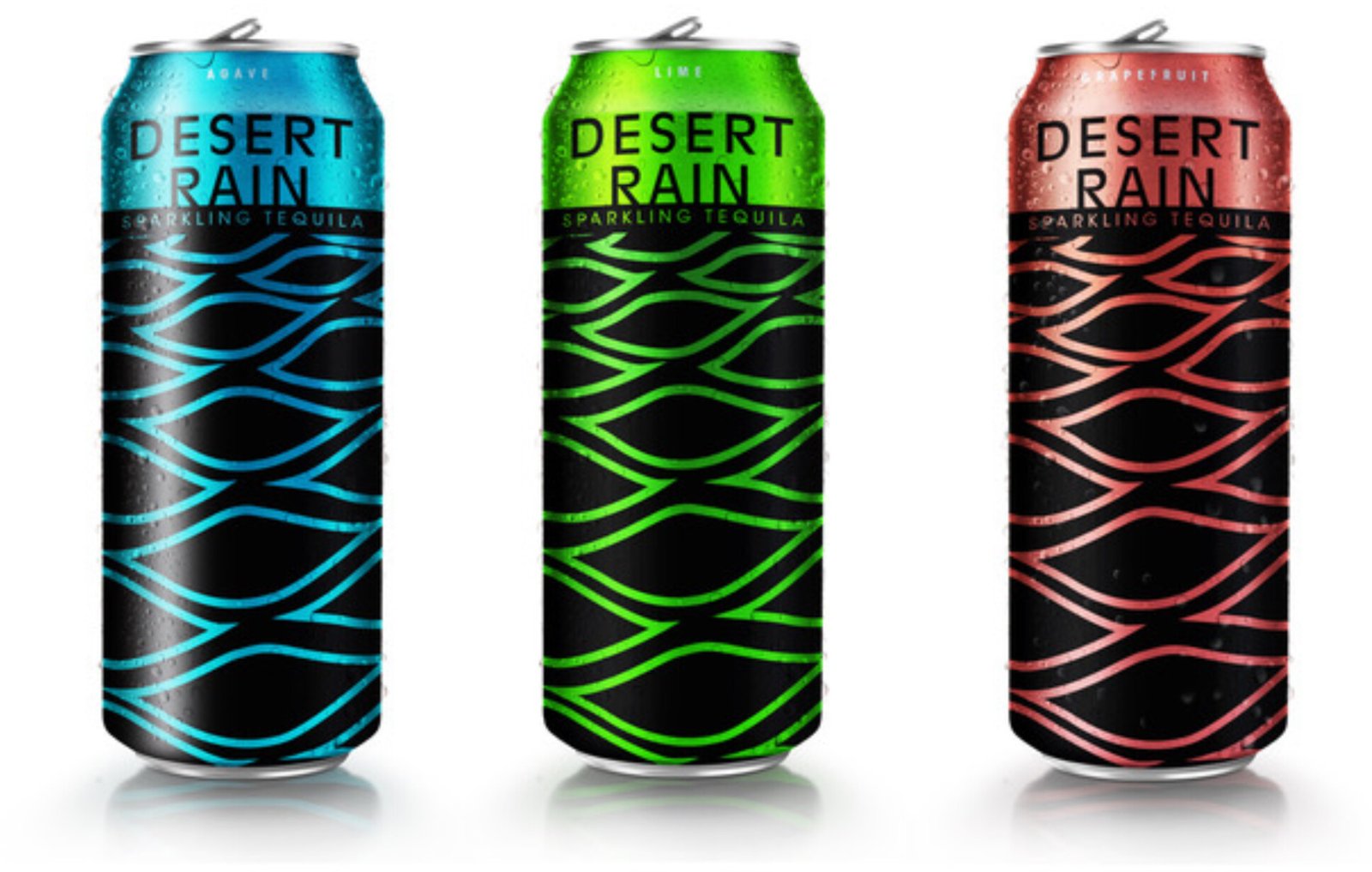
A nod to the indigenous roots echoing the designs of the Mayan culture mixed with prohibition era gumption brought into present day, we introduce the strong presence with a delicate natural touch.

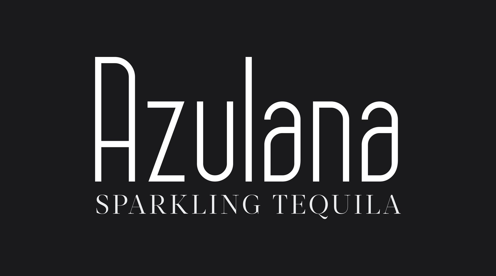
This typeface is a more organic take as the lower case “a” has a more botanical leaf feel, although the agave plant doesn’t have leaves like this, it represents birth, vitality, fertility, sensuality and endurance which are key elements in the mindset of women in our target.

Share